At every conference I attend, I hear education leaders crying out, “We’re data rich and information poor!” It’s such a pervasive problem that there’s an acronym for it: DRIP. In recent years, the education sector’s response to this lack of connected, insightful data has been, “We’ve got you. We’ll build you even bigger, better teacher dashboards.”
The teacher dashboard obsession in education has been both a groundswell—from districts that know they need to make better use of their student data—and a directive from the top. Dashboards were one of the highest priorities in the U.S. Department of Education’s 2015 National Education Technology Plan.
Dashboards are taking up much of the ed-tech sector’s brainpower and resources right now. Meanwhile, initial studies (like these) and plentiful anecdotal evidence are telling us that teachers don’t actually use these dashboards.

When teachers do use the dashboards they’re handed, we know very little about how their teaching styles and techniques are influenced. Interestingly, one study found that teachers who naturally cater to lower-ability students focused more of their attention on middle and higher-ability students after referencing a data dashboard.
Of course, not all dashboards are created equal. Some require teachers to be straight-up data scientists, while others are so simple they don’t tell a teacher anything he or she doesn’t already know. What most data dashboards share, though, is this: They’re designed by technologists, then handed to teachers who view them as one more technology thing I don’t have time for.
Many sectors including healthcare are in this same boat right now, focused heavily on dashboards. The question in our sector is: Are teacher dashboards the most effective use of student data? Disruption is inevitably coming—hopefully soon—to bring insightful student information to teachers, students, and families where they are, when it’s useful, and right within the tools they’re already using.
Why Teacher Dashboards are Good (For Now)
Dashboards are a technology that’s readily available today. They’re something tangible districts can work towards that generate some amount of useful information for teachers today. And on the backend, dashboards seed a school district with critical processes and skills around data-informed decision making. But don’t expect teachers to use them daily to guide instruction.
Additionally, every school district and education leader has different challenges, goals, and needs. And almost all of today’s dashboards contain multiple views for teachers, administrators, and other central office or school building personnel. Arguably, though, the more a dashboard serves everybody, the less it serves anybody.
A recent Tech Edvocate article laid out criteria for a useful teacher dashboard:
- Easy to use
- Provides context
- Facilitates quick decisions
- Presents information from multiple systems (aka, data interoperability is required)
Are charts on a tablet or desktop PC the best we can do to help teachers meet student needs? At Ed-Fi, we think the sector should be reaching for more.
Why Ed-Fi Isn’t Betting on Dashboards Long Term
That same Tech Edvocate article talks about the importance of timing in terms of the data that’s captured in a teacher dashboard. Is it most helpful to see a student’s progress over a month? A semester? An entire year?
But what about the issue of timing when it comes to dashboard usage? When does a teacher have time to sit down, pull up his or her dashboard, and interpret what it’s saying about each student? During a staff meeting or parent-teacher conference, perhaps. In the classroom when a student is struggling with the subject matter, behaving inappropriately, or walks in the door after being chronically absent? Probably not.
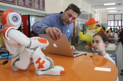
The future might involve teachers wearing techie glasses with student insights in their periphery at all times, or earpieces with a voice assistant letting them know what each student needs. Whether the insights are right in a teachers’ eyes, ears, delivered by a digital teaching assistant, a robot, or something we haven’t even dreamed of is yet to be determined. That’s the fun part! And we should be dreaming big.
Source: U.S. Department of Education
However the technology manifests, the future of data visualization in education should include actionable insights, real-time help, and enhanced interactivity for teachers, students, and families.
What the Future Looks Like (Hopefully)
Actionable Insights & Real-Time Help
What if you could only check your gas gauge at the gas station? You’d be left doing a lot of guesswork in between fill-ups. This is how teacher dashboards operate; mildly useful, guesswork required. Other industries are surfacing historical data within the tools they’re already using (their gas gauges are right in their cars).
One sector that has become especially adept at surfacing data in context and in real-time is the retail industry. Not surprisingly, Walmart was the first retail giant to use predictive technology in all of its purchasing and store layout decisions, with emphasis on how weather affects purchasing behavior. It’s how they knew exactly which two items Texans would run to the store for when Hurricane Harvey was brewing.
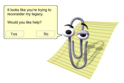
How can predictive analytics be used in our classrooms? For a teacher managing dozens of students, they need alerts when they matter, without being disruptive. This might look something like Clippy reincarnated—an interoperable spirit guide that lives within a teacher’s learning management system and other apps to alert them when a student is falling behind, and what’s most likely to help.
Source: New York Magazine
Ideally, meaningful insights are accessible within each of the tools our teachers already use, regardless of which company created them, instead of living in one isolated dashboard (the gas station).
Enhancing Interactivity
What if a teacher could reference the likelihood of one approach working for a student versus another based on a wealth of historical data, right when they’re interacting with that student? Armed with these insights, he or she could apply their own skills, training, and experience, consider their relationship with that student, and boost that student’s achievement. This assistive technology approach has the potential to be revolutionary.
There are some ed-tech companies moving in the right direction. Spotlight’s College & Career Readiness Guide and video report cards (built on Ed-Fi) are helpful because they provide context— comparing student performance to previous semesters and years, as well as to millions of other students. Then, they give actionable guidance. Much more useful than your classic report card, eh?
Source: Spotlight Education
Learning management systems like Google Classroom are upping the interactivity by providing an environment for teachers and students to see the same information and communicate virtually, in real-time. These views are zoomed in on assignments and grades, though, and don’t layer in dimensions like special needs or social and emotional learning.
Do students care about any of these more innovative tools that are designed for them? Former educator Rupa Gupta says no. She developed Sown to Grow so students would shape and therefore hopefully care about their own data dashboards.
In the future, students absolutely need to be contributing to their own data visualizations. This will keep them invested, informed, and owning their information—partnering up with educators to write their own stories.
Let’s Think & Design Bigger
Let’s acknowledge that “The Dashboard” is here for now, but it’s only one tool amongst many. Ed-Fi is pushing for the most creative, human-centered solutions in education. We think the ed-tech sector can do better than graphs and charts that require teachers to be data scientists and to pull up one more thing.
We’re rallying for interoperability because interoperable systems are a must in order for student data to be secure, accurate, and useful. And we need the sector to rally alongside us sooner rather than later, for our education system to serve our students and teachers and keep up with the rest of the world.
If you’re an education technologist or leader, we urge you to think and design bigger. We also urge you to spend more time in the classroom—witnessing what a day in the life of teachers and students really looks like. We think you’ll find that the answer is something much more transformative than an even better dashboard.
